Last post, I talked about combining textual and network analysis. Both are becoming standard tools in the methodological toolkit of the digital humanist, sitting next to GIS in what seems to be becoming the Big Three in computational humanities.
Data as Context, Data as Contextualized
Humanists are starkly aware that no particular aspect of a subject sits in a vacuum; context is key. A network on its own is a set of meaningless relationships without a knowledge of what travels through and across it, what entities make it up, and how that network interacts with the larger world. The network must be contextualized by the content. Conversely, the networks in which people and processes are situated deeply affect those entities: medium shapes message and topology shapes influence. The content must be contextualized by the network.
At the risk of the iPhonification of methodologies 1, textual, network, and geographic analysis may be combined with each other and traditional humanities research so that they might all inform one another. That last post on textual and network analysis was missing one key component for digital humanities: the humanities. Combining textual and network analysis with traditional humanities research (rather than merely using the humanities to inform text and network analysis, or vice-versa) promises to transform the sorts of questions asked and projects undertaken in Academia at large.
Just as networks can be used to contextualize text (and vice-versa), the same can be said of networks and maps (or texts and maps for that matter, or all three, but I’ll leave those for later posts). Now, instead of starting with the maps we all know and love, we’ll start by jumping into the deep end by discussing maps as any sort of representative landscape in which a network can be situated. In fact, I’m going to start off by using the network as a map against which certain relational properties can be overlaid. That is, I’m starting by using a map to contextualize a network, rather than the more intuitive other way around.
Using Maps to Contextualize a Network
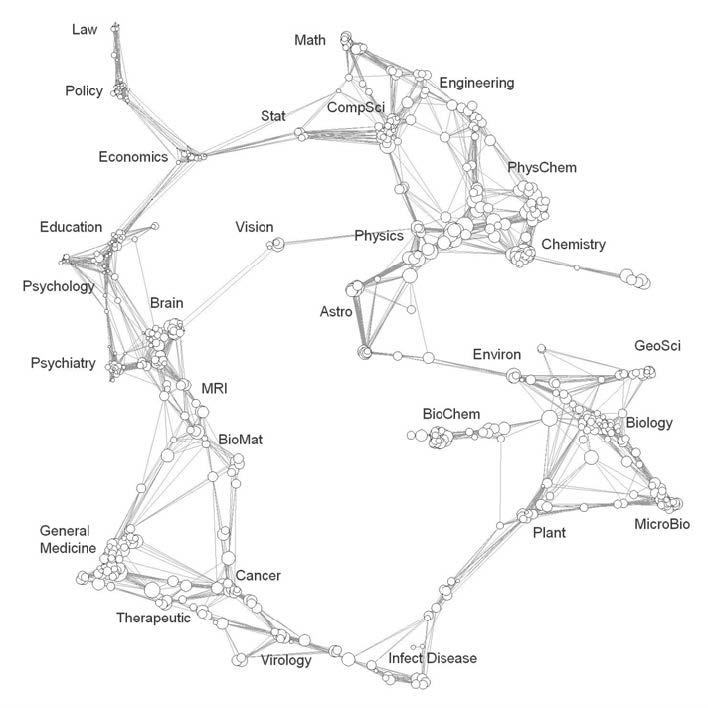
The base map we’re discussing here is a map of science. They’ve made their rounds, so you’ve probably seen one, but just in case you haven’t here’s a brief description: some researchers (in this case Kevin Boyack and Richard Klavans) take tons on information from scholarly databases (in this case the Science Citation Index Expanded and the Social Science Citation Index) and create a network diagram from some set of metrics (in this case, citation similarity). They call this network representation a Map of Science.
We can debate about the merits of these maps ’till we’re blue in the face, but let’s avoid that for now. To my mind, the maps are useful, interesting, and incomplete, and the map-makers are generally well-aware of their deficiencies. The point here is that it is a map: a landscape against which one can situate oneself, and with which one may be able to find paths and understand the lay of the land.
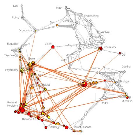
In Boyack, Börner 2, and Klavans (2007), the three authors set out to use the map of science to explore the evolution of chemistry research. The purpose of the paper doesn’t really matter here, though; what matters is the idea of overlaying information atop a base network map.
The images above are the funding profiles of the NIH (National Institutes of Health) and NSF (National Science Foundation). The authors collected publication information attached to all the grants funded by the NSF and NIH and looked at how those publications cited one another. The orange edges show connections between disciplines on the map of science that were more prevalent within the context a particular funding agency than they were compared to the entire map of science. Boyack, Börner 3, and Klavans created a map and used it to contextualize certain funding agencies. They and other parties have since used such maps to contextualize universities, authors, disciplines, and other publication groups.
From Network Maps to Geographic Maps
Of course, the Where’s The Beef™ section of this post still has yet to be discussed, with the beef in this case being geography. How can we use existing topography to contextualize network topology? Network space rarely corresponds to geographic place, however neither of them alone can ever fully represent the landscape within which we are situated. A purely geographic map of ancient Rome would not accurately represent the world in which the ancient Romans lived, as it does not take into account the shortening of distances through well-trod trade routes.
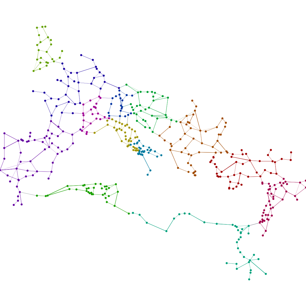
Enter Stanford DH ninja Elijah Meeks. In two recent posts, Elijah discussed the topology/topography divide. In the first, he created a network layout algorithm which took a network with nodes originally placed in their geographic coordinates, and then distorted the network visualization to emphasize network distance. The visualization above shows the network laid out geographically. The one below shows the Imperial Roman trade routes with network distances emphasized. As Elijah says, “everything of the same color in the above map is the same network distance from Rome.”
Of course, the savvy reader has probably observed that this does not take everything into account. These are only land routes; what about the sea?
Elijah’s second post addressed just that, impressively applying GIS techniques to determine the likely route ships took to get from one port to another. This technique drives home the point he was trying to make about transitioning from network topology to network topography. The picture below, incidentally, is Elijah’s re-rendering of the last visualization taking into account both land and see routes. As you can see, the distance from any city to any other has decreased significantly, even taking into account his network-distance algorithm.
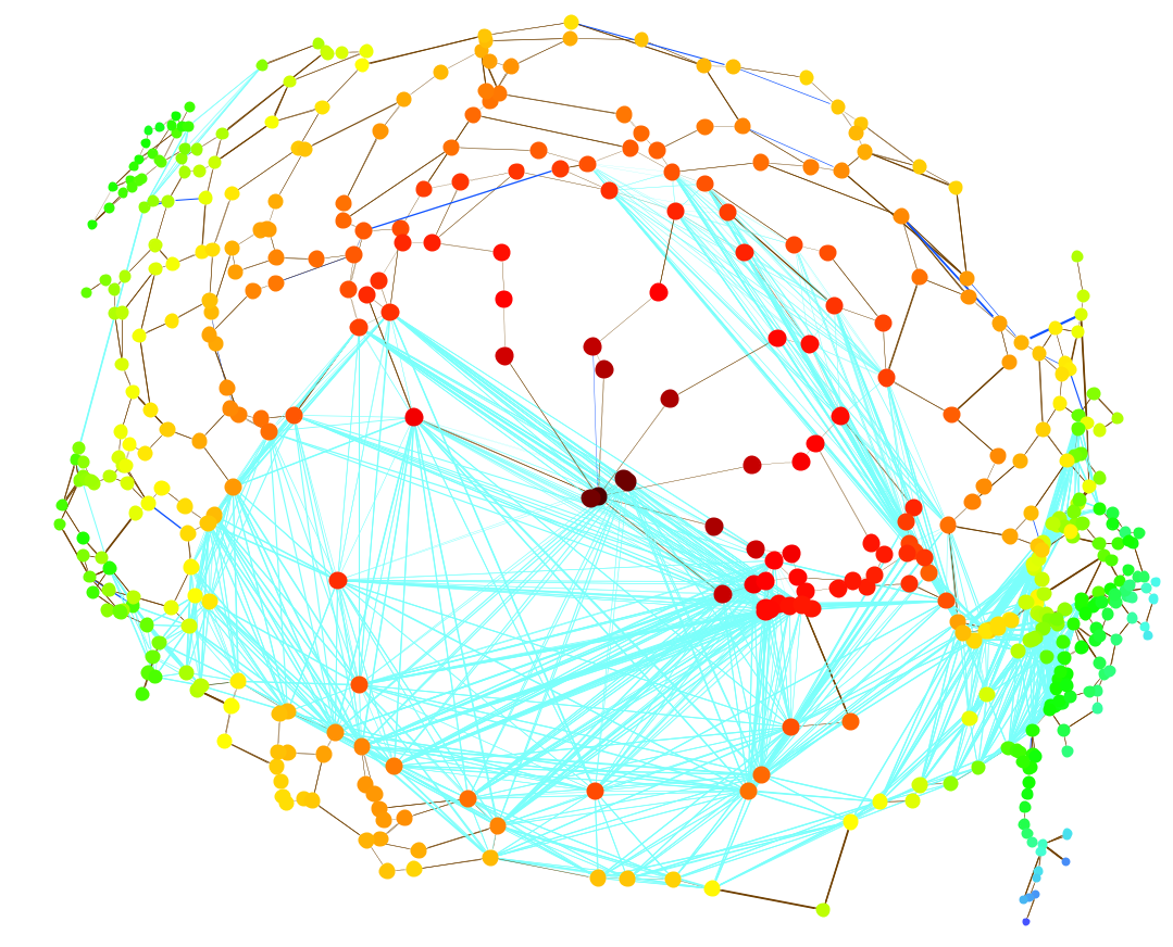
Roman Network by Elijah Meeks, nodes laid out using geography and network distance, taking into account two varieties of routes.
The above network visualization combines geography, two types of transportation routes, and network science to provide a more nuanced at-a-glance view of the Imperial Roman landscape. The work he highlighted in his post transitioning from topology to topography in edge shapes is also of utmost importance, however that topic will need to wait for another post.
The Republic of Letters (A Brief Interlude)
Elijah was also involved in another Stanford-based project, one very dear to my heart, Mapping the Republic of Letters. Much of my own research has dealt with the Republic of Letters, especially my time spent under Bob Hatch, and Paula Findlen, Dan Edelstein, and Nicole Coleman at Stanford have been heading up an impressive project on that very subject. I’ll go into more details about the Republic in another post (I know, promises promises), but for now the important thing to look at is their interface for navigating the Republic.
The team has gone well beyond the interface that currently faces the public, however even the original map is an important step. Overlaid against a map of Europe are the correspondences of many early modern scholars. The flow of information is apparent temporally, spatially, and through the network topology of the Republic itself. Now as any good explorer knows, no map is any substitute for a thorough knowledge of the land itself; instead, it is to be used for finding unexplored areas and for synthesizing information at a large scale. For contextualizing.
If you’ll allow me a brief diversion, I’d like to talk about tools for making these sorts of maps, now that we’re on the subject of letters. Elijah’s post on visualizing network distance included a plugin for Gephi to emphasize network distance. Gephi’s a great tool for making really pretty network visualizations, and it also comes with a small but potent handful of network analysis algorithms.
I’m on the development team of another program, the Sci² Tool, which shares a lot of Gephi’s functionality, although it has a much wider scope and includes algorithms for textual, geographic, and statistical analysis, as well as a somewhat broader range of network analysis algorithms.
This is by no means a suggestion to use Sci² over Gephi; they both have their strengths and weaknesses. Gephi is dead simple to use, produces the most beautiful graphs on the market, and is all-around fantastic software. They both excel in different areas, and by using them (and other tools!) together, it is possible to create maps combining geographic and network features without ever having to resort to programming.
The above image was generated by combining the Sci² Tool with Gephi. It is the correspondence network of Hugo Grotius, a dataset I worked on while at Huygens ING in The Hague. They are a great group, and another team doing fantastic Republic of Letters research, and they provided this letters dataset. We just developed this particular functionality in Sci² yesterday, so it will take a bit of time before we work out the bugs and release it publicly, however as soon as it is released I’ll be sure to post a full tutorial on how to make maps like the one above.
This ends the public service announcement.
Moving Forward
These maps are not without their critics. Especially prevalent were questions along the lines of “But how is this showing me anything I didn’t already know?” or “All of this is just an artefact of population densities and standard trade routes – what are these maps telling us about the Republic of Letters?” These are legitimate critiques, however as mentioned before, these maps are still useful for at-a-glance synthesis of large scales of information, or learning something new about areas one is not yet an expert in. Another problem has been that the lines on the map don’t represent actual travel routes; those sorts of problems are beginning to be addressed by the type of work Elijah Meeks and other GIS researchers are doing.
To tackle the suggestion that these are merely representing population data, I would like to propose what I believe to be a novel idea. I haven’t published on this yet, and I’m not trying to claim scholarly territory here, but I would ask that if this idea inspires research of your own, please cite this blog post or my publication on the subject, whenever it comes out.
We have a lot of data. Of course it doesn’t feel like we have enough, and it never will, but we have a lot of data. We can use what we have, for example collecting all the correspondences from early modern Europe, and place them on a map like this one. The more data we have, the smaller time slices we can have in our maps. We create a base map that is a combination of geographic properties, statistical location properties, and network properties.
Start with a map of the world. To account for population or related correlations, do something similar to what Elijah did in this post, encoding population information (or average number of publications per city, or whatever else you’d like to account for) into the map. On top of that, place the biggest network of whatever it is that you’re looking at that you can find. Scholarly communication, citations, whatever. It’s your big Map of YourFavoriteThingHere. All of these together are your base map.
Atop that, place whatever or whomever you are studying. The correspondence of Grotius can be put on this map, like the NIH was overlaid atop the Map of Science, and areas would light up and become larger if they are surprising against the base map. Are there more letters between Paris and The Hague in the Grotius dataset then one would expect if the dataset was just randomly plucked from the whole Republic of Letters? If so, make that line brighter and thicker.
By combining geography, point statistics, and networks, we can create base maps against which we can contextualize whatever we happen to be studying. This is just one possible combination; base maps can be created from any of a myriad of sources of data. The important thing is that we, as humanists, ought to be able to contextualize our data in the same way that we always have. Now that we’re working with a lot more of it, we’re going to need help in those contextualizations. Base maps are one solution.
It’s worth pointing out one major problem with base maps: bias. Until recently, those Maps of Science making their way around the blogosphere represented the humanities as a small island off the coast of social sciences, if they showed them at all. This is because the primary publication venues of the arts and humanities were not represented in the datasets used to create these science maps. We must watch out for similar biases when constructing our own base maps, however the problem is significantly more difficult for historical datasets because the underrepresented are too dead to speak up. For a brief discussion of historical biases, you can read my UCLA presentation here.



Hey Scott, excellent post as always. While I haven’t tried to formally contextualize my maps (network or geographic–I much prefer “map” over “visualization”, which still sounds to me to be some kind of New Age self-help tool) using a standard basemap, I have noticed that whenever I’ve done something approaching that, I receive the biggest ho-hum response. It’s almost as if contextualizing a map makes it less exciting, abstract and/or sophisticated. I wonder if there is a subtle pressure to produce a unique flower that fundamentally only exists in the world of study you’re currently engaged in, as if reference or grounding in a larger world is instead seen as a sign of the derivative nature of the work, rather than its connection to a larger system.
Oh, and I hope you’ll join me for a Gephi/Sci2 knifefight complete with choreographed dance and rhythmic background music.
That’s unfortunate news, but I suppose not too surprising. It also might be invoking the anti-positivist movement in the humanities, under the assumption that any base map is trying to represent an objective reality. The way I sidestep this issue is pointing out that neither the union nor the intersection of all subjective experience is equivalent to objective reality. And it doesn’t matter. The union of all this data is still *really useful* for situating one or a small group of subjective experiences against the larger set.
Of course. There will be synchronized snapping.